

Libby
UX • UI
The project was inspired by my own struggles using the Libby app daily. I wanted to work on finding solutions for the problems I faced instead of redesigning something already great.
Libby
Libby is one of the OverDrive applications where you can borrow ebooks and digital audiobooks from your public library, the only thing you need is a library card. This free app allows you to stream books with Wi-Fi or mobile data, or download them for offline use and read anytime, anywhere.
Timeline: 2 weeks
Role: User Researcher and UX Designer
Tools: Figma, Adobe Photoshop, Miro
Platform: iOS
The Challenge
Libby was designed to make finding, borrowing, and enjoying free ebooks and audiobooks easier than ever. Compared with its “classic” version, the OverDrive app, Libby looks more friendly and modern, however, its usability still presents some challenges.
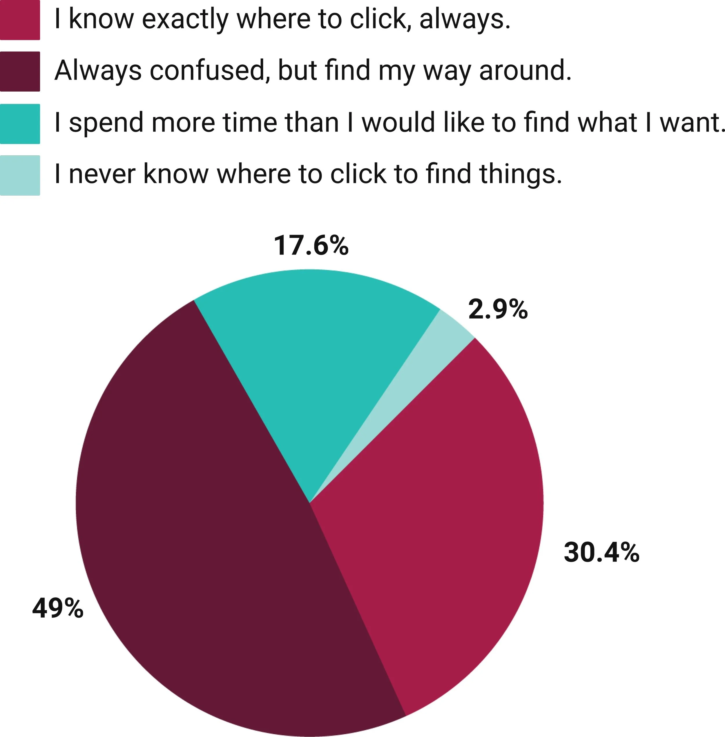
Using the app daily, I noticed patterns of frustration with my interactions. I would need to click everywhere until I could find what I was looking for. Out of curiosity, I asked other users and the numbers inspired me to develop this project.
However, the app developer (OverDrive) released an update not long ago and implementing big changes is not an option. The goal is to optimize the navigation with the minimal interference as possible in the current design.
The Process

The Research
A survey was used to get a general idea of who the users are and what is their generic experience with the app. The goal was to develop a deeper understanding of familiar navigation patterns and how people use them; and from these findings, determine the hierarchy of information and where to look for insights and solutions.
With a better understanding of the audience, Zoom interviews were scheduled with 5 Libby users. The objective is to observe the main goals and actions, how the current navigation is pursued and the user’s pain and motivations.
During the interviews, groups of icons were presented to test familiarity, understanding and accessibility.

Synthesizing
After analyzing all the data collected between the survey, interviews and my notes, I was able to identify some main insights:

Ideation
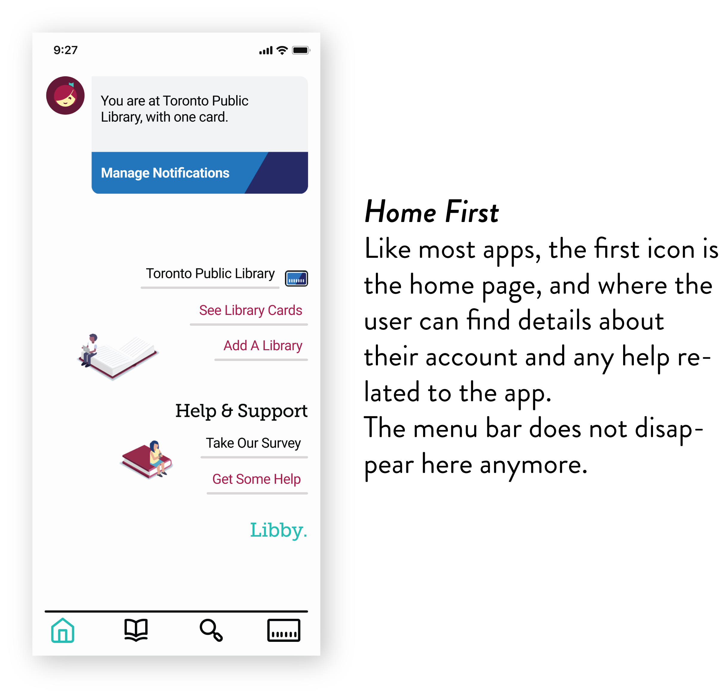
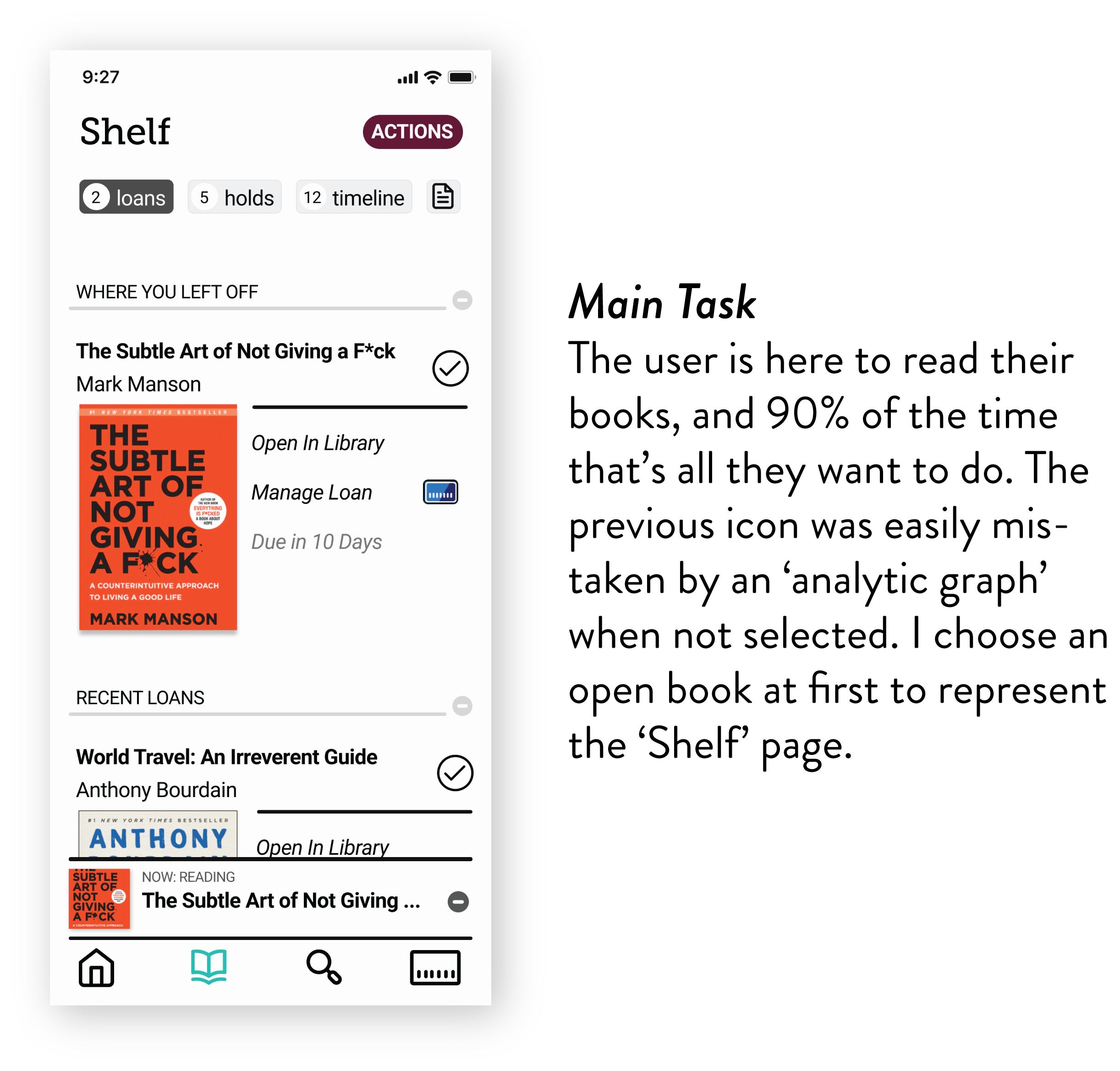
Without being selected, the menu icons have imperceptible details that end up generating unclear meanings. The ‘receipt’ feature on the ‘Shelf’ page is vague and it shows differently to each user using emoticons.
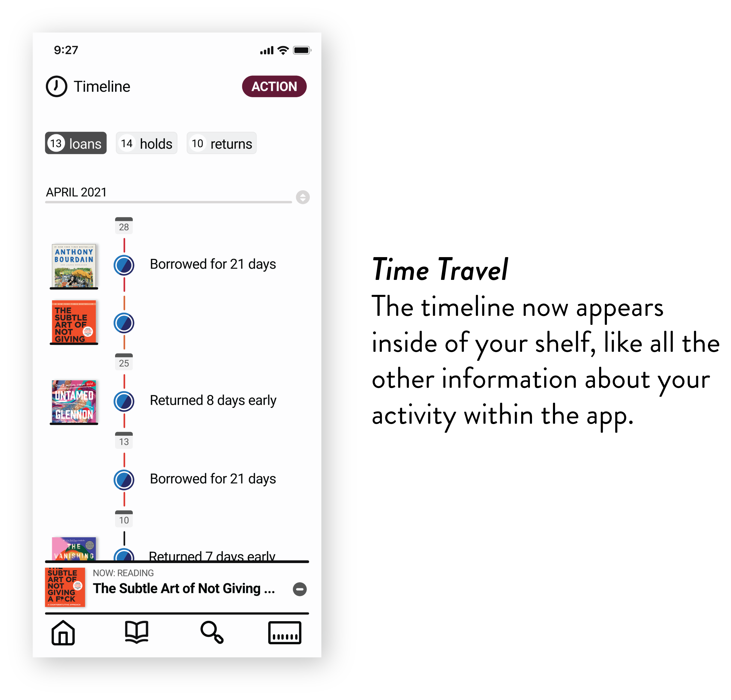
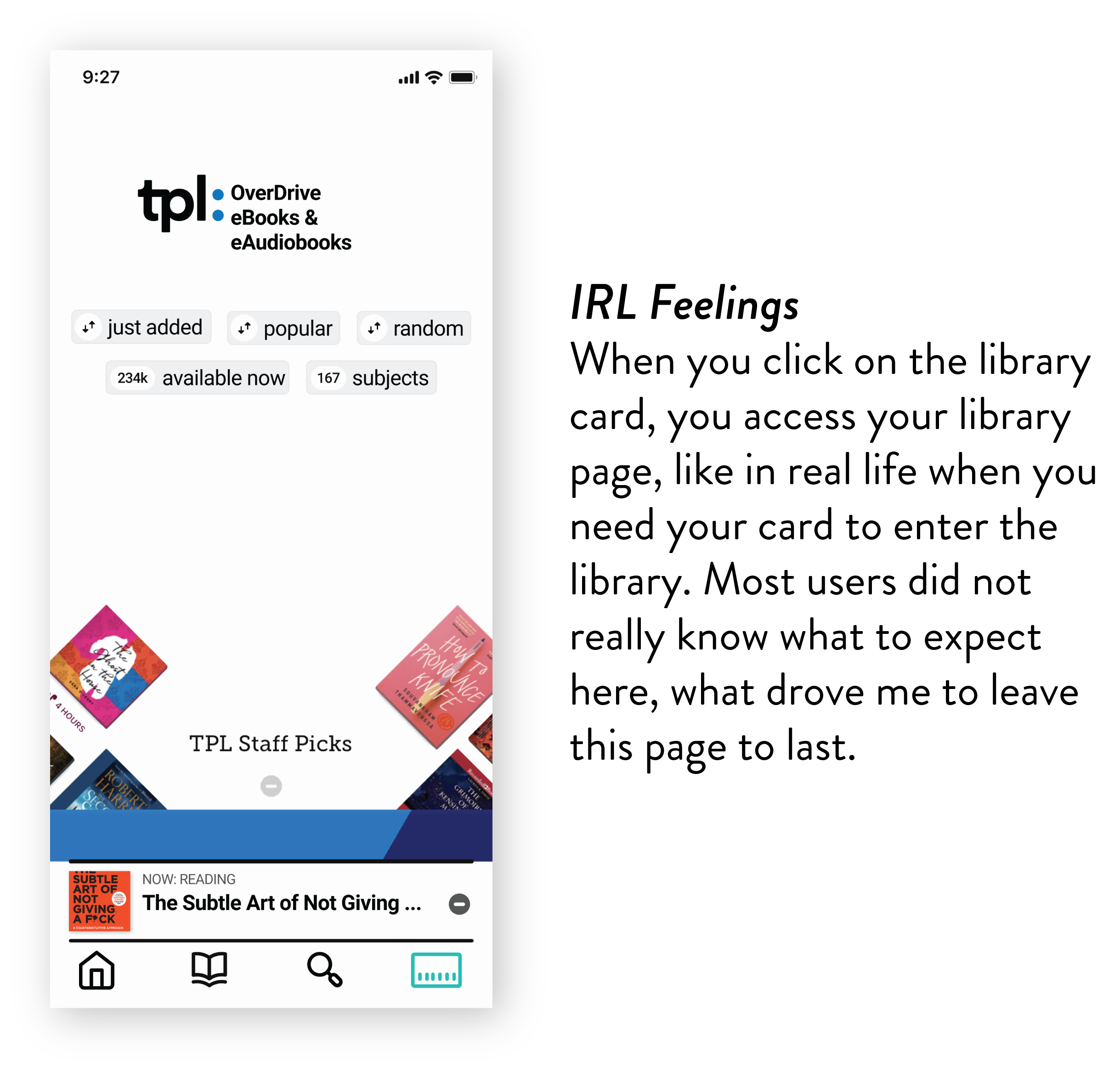
Most users think the ‘Timeline’ icon on the menu bar is a feature that how much time you have left with your loans or something like that. That is not accurate and it leads people to frustration out of necessity. Most people would look into that information inside of their ‘Shelf’ page.
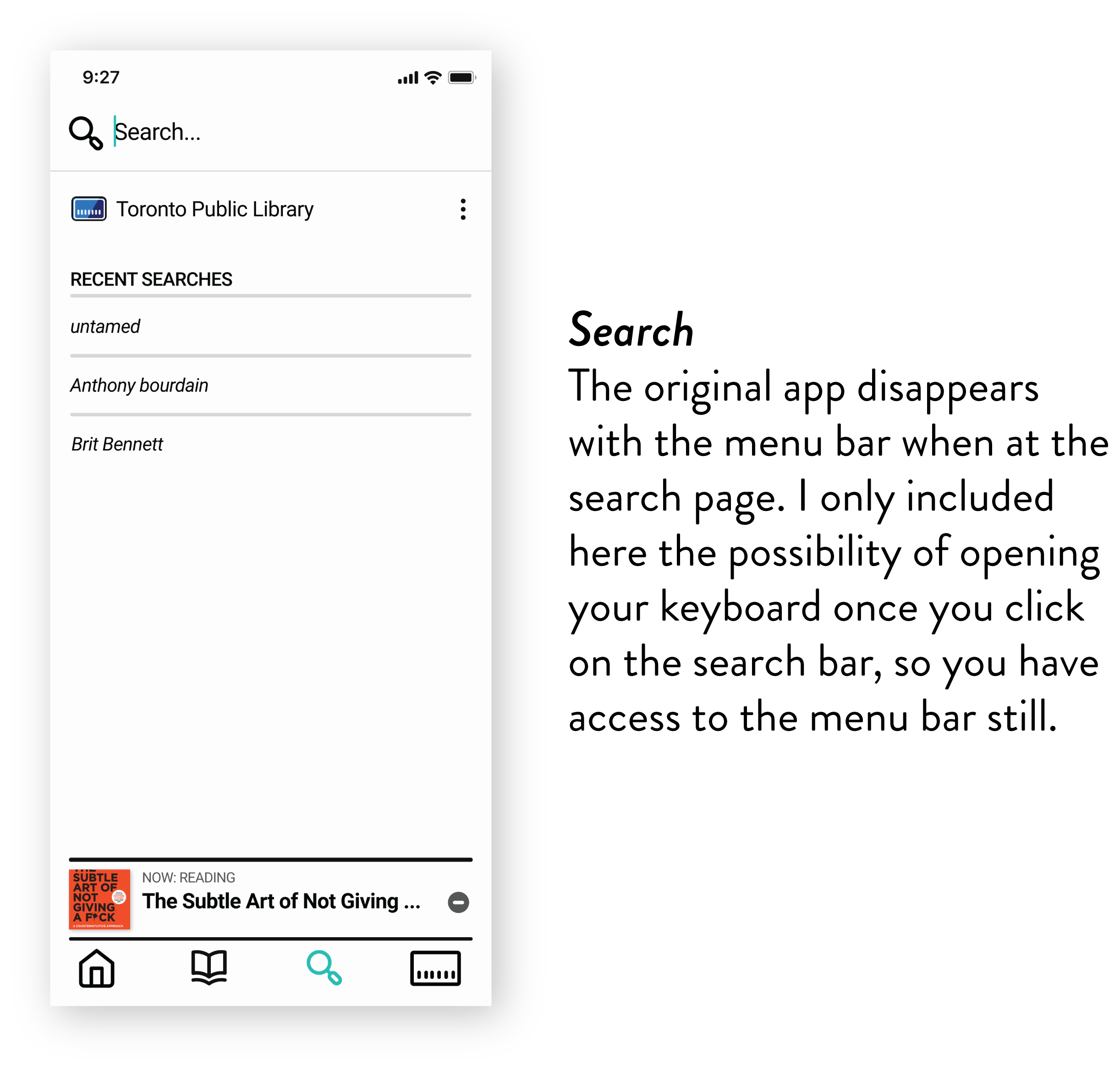
You can’t access your current book from all the pages, and the ‘hide and show’ game makes you lose access to the main menu.
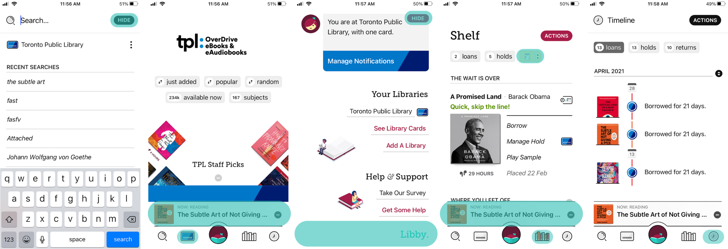
Original Screens
Familiar Space
Observing the most commonly used Apps, I tried to identify how to make a ‘Menu Bar’ as most intuitive and recognizable as possible.


The First Concept
Based on my findings, I developed the prototype.
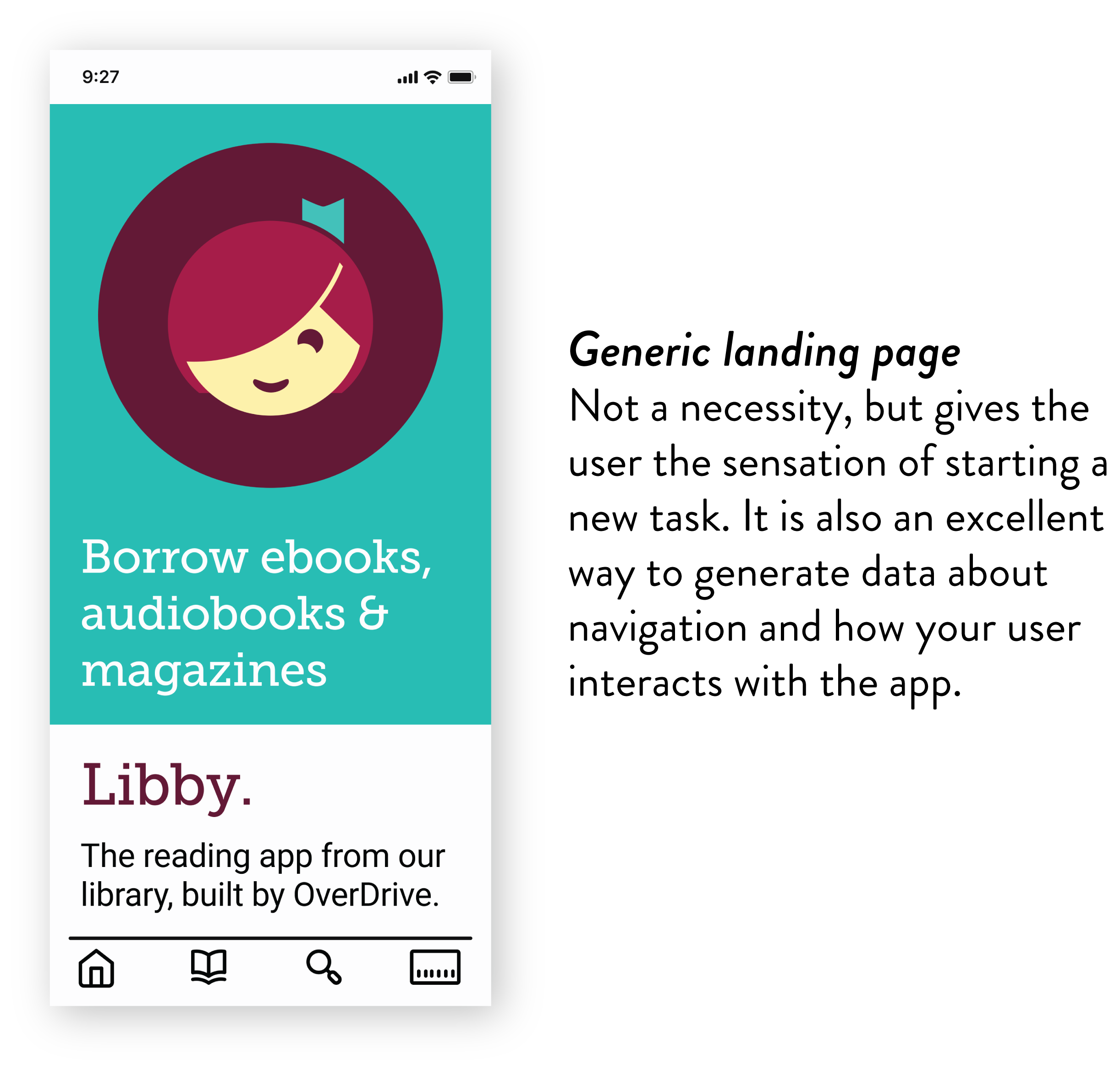
I applied a ‘landing page’ with elements from Libby that would not interfere with anything in the app functionality and put the new icons menu for testing.
User Testing
I invited 6 Libby users to test the prototype I designed.
With the first round of usability tests, I was looking to investigate if the modifications I made would improve the overall experience and if the interface became more intuitive and efficient.
The process pointed to possible confusion, but also positive feedback.


With real-life user insights about my design, I went back to the board to make some changes. By making these alterations, I hope to improve the effectiveness of the new menu and the overall Libby experience.
Since the ‘open book’ icon did not provide the clarity I expected, I went back to the ‘pile of books’ format, but with a little twitch following a more common ‘Library’ icon, so it would look a little less than a bar graph and a little more like books.
I also noticed how bright the icons could become when selected, so I ran a colour accessibility test and changed the way the icon gets highlighted when selected.

Next steps
Further testing with a higher number of users would provide good data to validate the improvement of the design experience.
During my research, users pointed desire to improve other features as well, and that could become a new project in the future. Discussing the level of difficulty and amount of work my suggested changes could take with developers would be an important step as well.
If you have insights about this project, I would love to hear your feedback.