RK Digital Advent Calendar
Product Design
In 2021, Rice Krispies® asked Leo Burnett to create a digital experience to celebrate the Christmas season. This was my first project at Leo; although, when I came along a lot of decisions had been made already and I made sure to bring the vision to life, in 2022, as the only Product Designer and now with data in my hands, I saw an opportunity.
The App
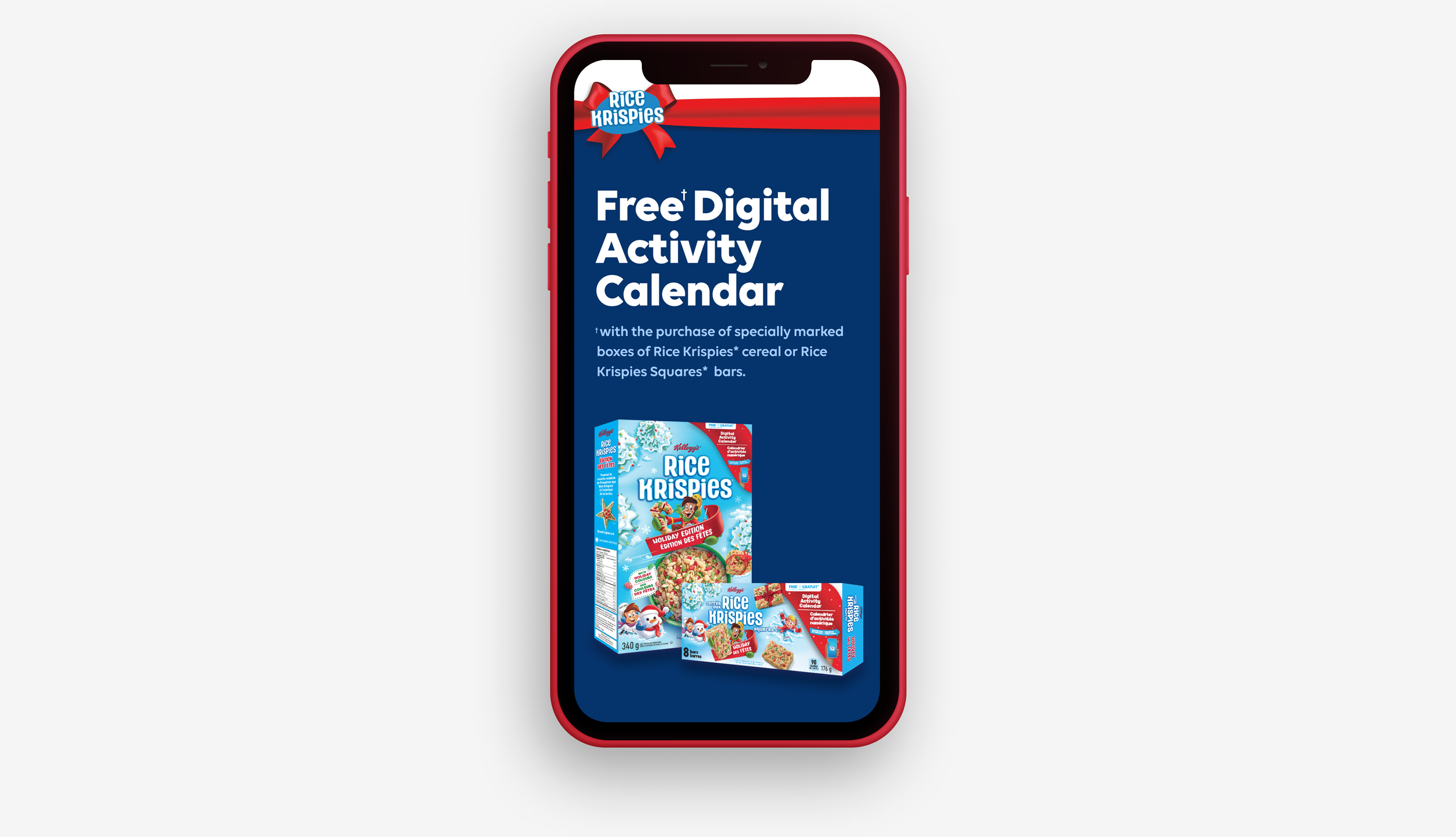
The Rice Krispies® Digital Advent Calendar is an annual mobile experience that starts with a box of your favourite treats. Once you scan the QR code, you open up a calendar with daily activities for the whole family during December. We started the tradition in 2021, and in 2022 we learned from it, leading us to enhance and elevate the overall app experience.
Timeline: 4 months
Role: Product Designer
Tools: Sketch, InVision, Miro
Platform: Mobile only
The Opportunity
Leveraging the valuable insights derived from the 2021 data on user behaviour, app usage, identified strengths, usability concerns, and the chance to lead the design efforts, I seized the moment to adopt a user-centred approach to the project while accommodating the clients’ goals.
Insights
Collaborating closely with the client and the internal team, we engaged in discussions covering vital aspects such as timelines, budgetary considerations, and project constraints. Each team contributed their unique pain points and shared valuable data, enabling us to gather a holistic view of the project. After gathering all the information I defined my main goals for the project:

Ideation
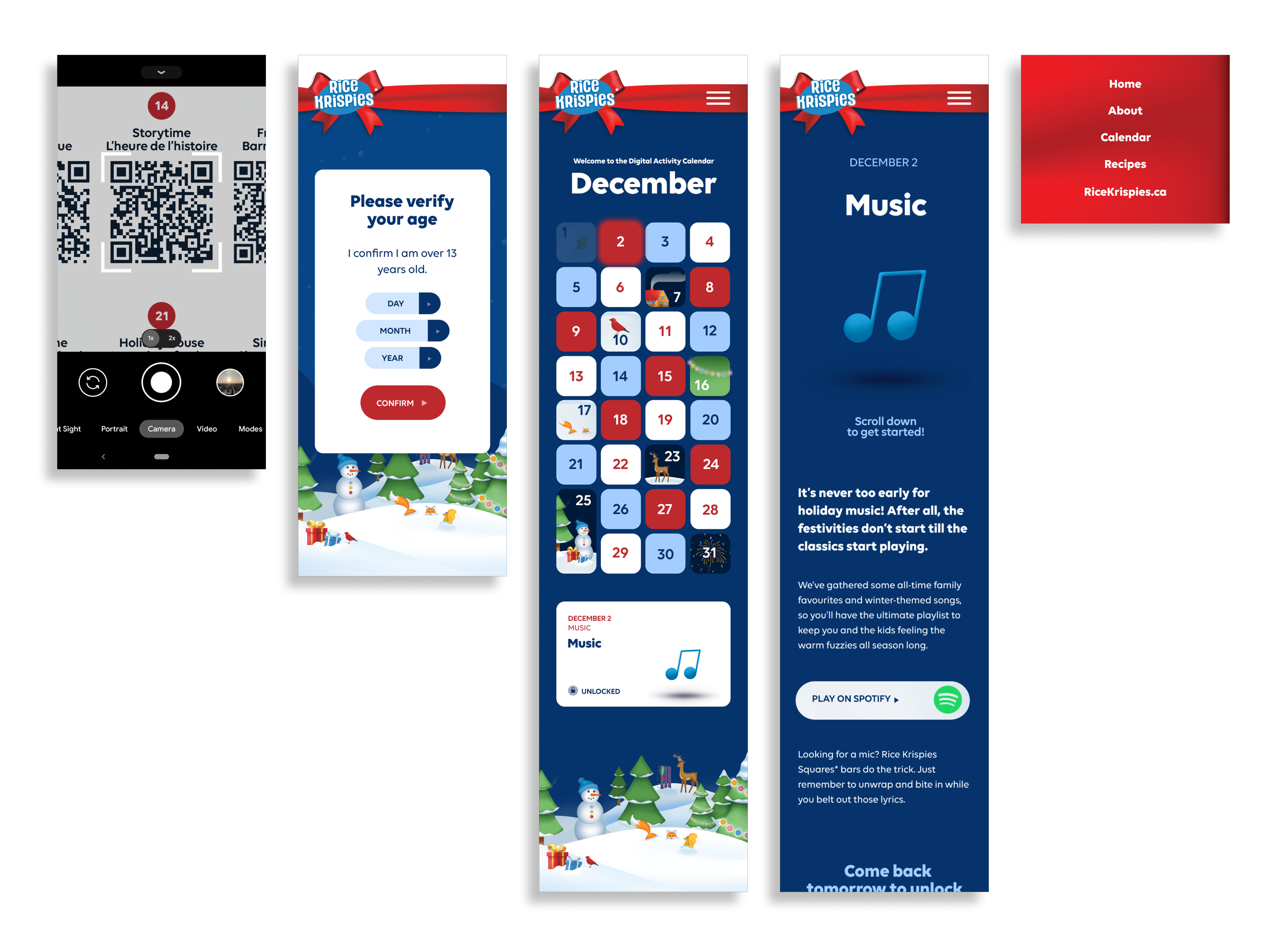
Looking back at the 2021 flow, I noticed a gap in the experience.
Once I confirm I am old enough I go straight to the activity, what is the point of the calendar if I am not curious enough to click around? The calendar icon is an extra click, is it relevant? Is the calendar fun enough? It looks just like the one I have hanging in my kitchen, but not very jolly...
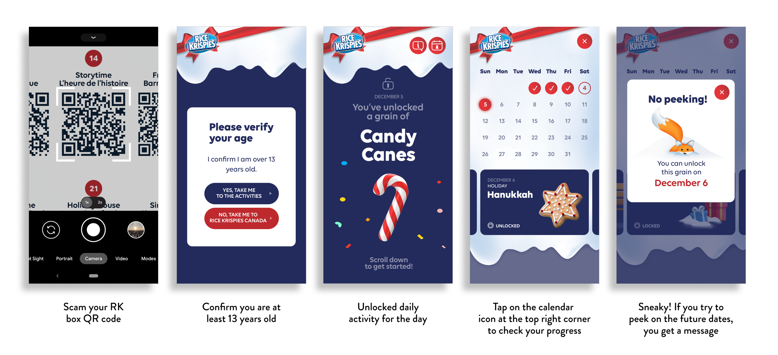
I went back to thinking about a ‘real life’ advent calendar and the heuristic principle of matching between the system and the real world. You get that beautiful and colourful paper box, full of treats, and every day you look forward to popping that little paper window open to find out what is inside. You don’t peek the next day and spoil the surprise (or you do, I don’t judge).
With that whimsical experience in mind, I sketched a possible new journey.
I also revisited the age gate. For legal reasons the YES/NO button did not make sense, we wanted to find a way to check our users’ age that was not going to set back the experience.

With the 2021 data, we encountered some opportunities to change and improve within content but also added new stakeholder goals. These changes had an impact on my approach to enhancing the user experience. My intention shifted towards not only improving the flow of the app but also creating a navigation system to accommodate the new requirements. This adaptive and responsive approach allowed me to successfully incorporate the evolving content and new goals while keeping a user-friendly and effective application in a recognizable and familiar pattern.
low-fi wireframes
Design
After presenting and discussing new ideas for the flow and calendar with the team and clients, I delved into the general design, drawing inspiration from the fresh holiday visuals of the physical box. My focus revolved around enhancing usability, and accessibility, and exploring potential animations.
With the new design in mind, I created the new and final version of the calendar.
As well as the new flow for all stages of the app (teaser until November 30th/ experience without the RK box in December/final experience with RK box in December)
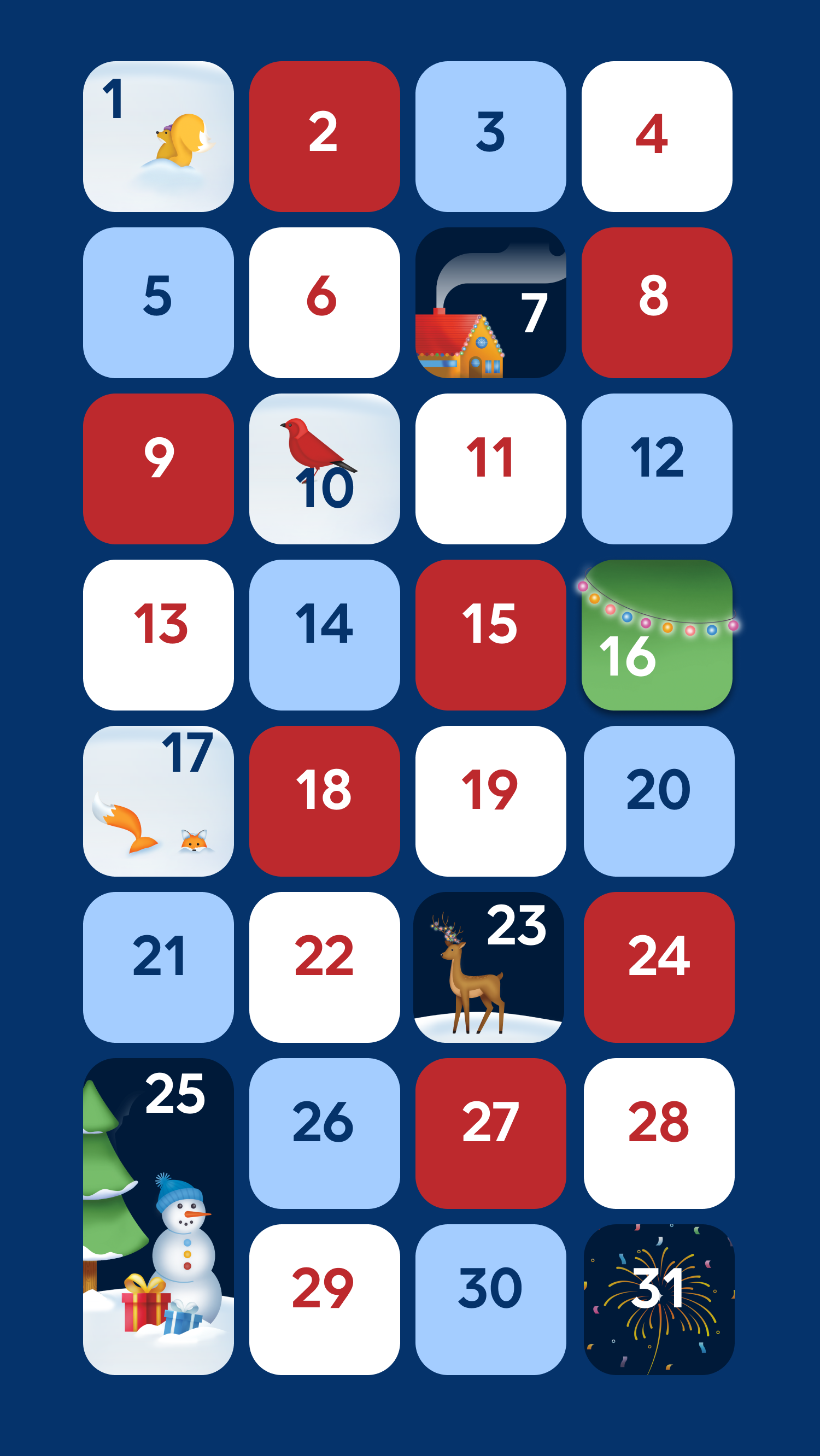
new calendar design

user journeys
new user flow hi-fi design
Feedback and Approval
The feedback received was overwhelmingly positive from both, the client and agency peers, and it was truly gratifying. Making the process quick on my end also left a lot of room for copy changes and technical adjustments. It's immensely satisfying to witness the project's success while ensuring efficient and collaborative execution.
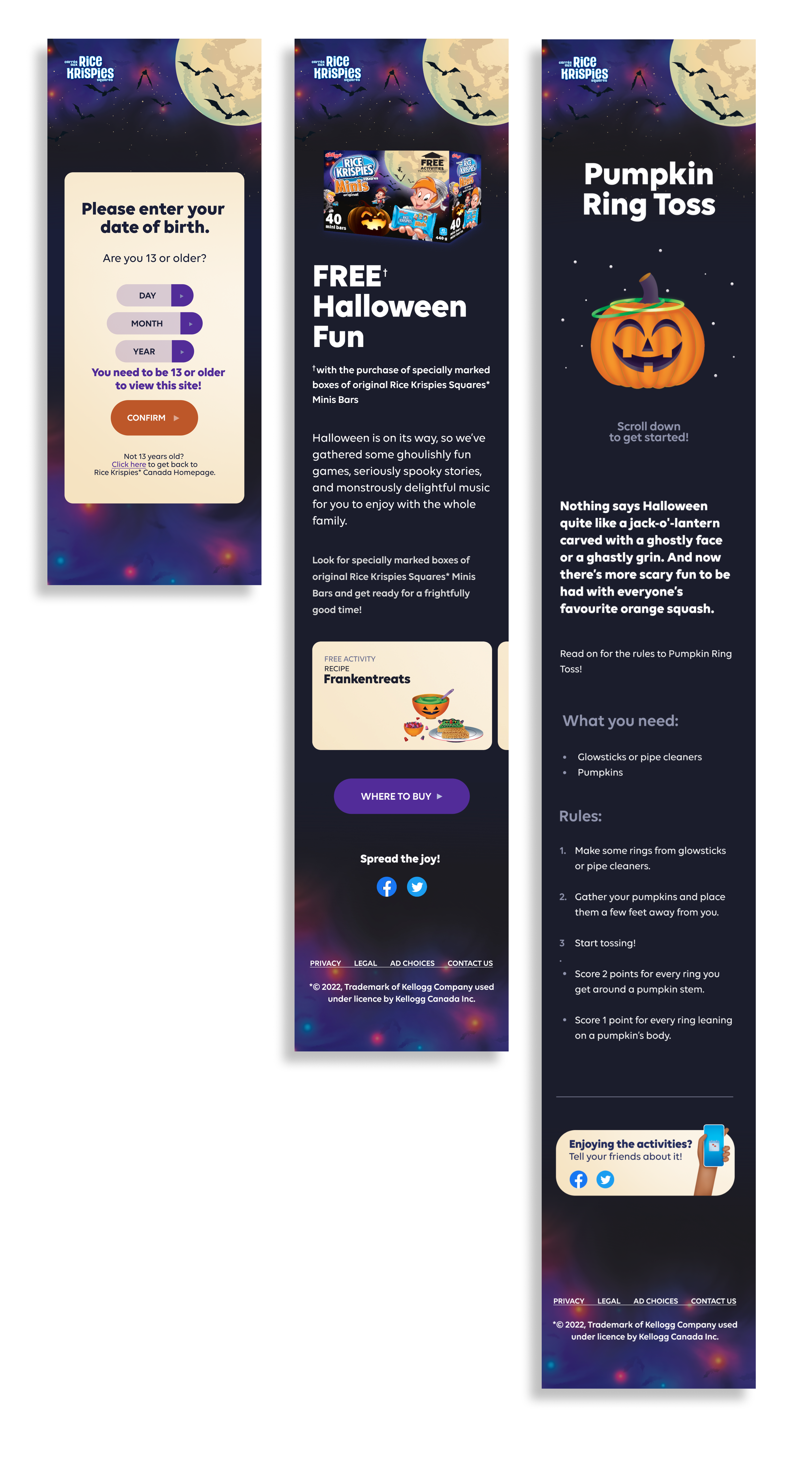
Bonus - Halloween
The enthusiasm surrounding the app's 2022 redesign paved the way for me to lead the design of the Halloween teaser app.
Below is a sample showcasing the design and flow.